
Static Table
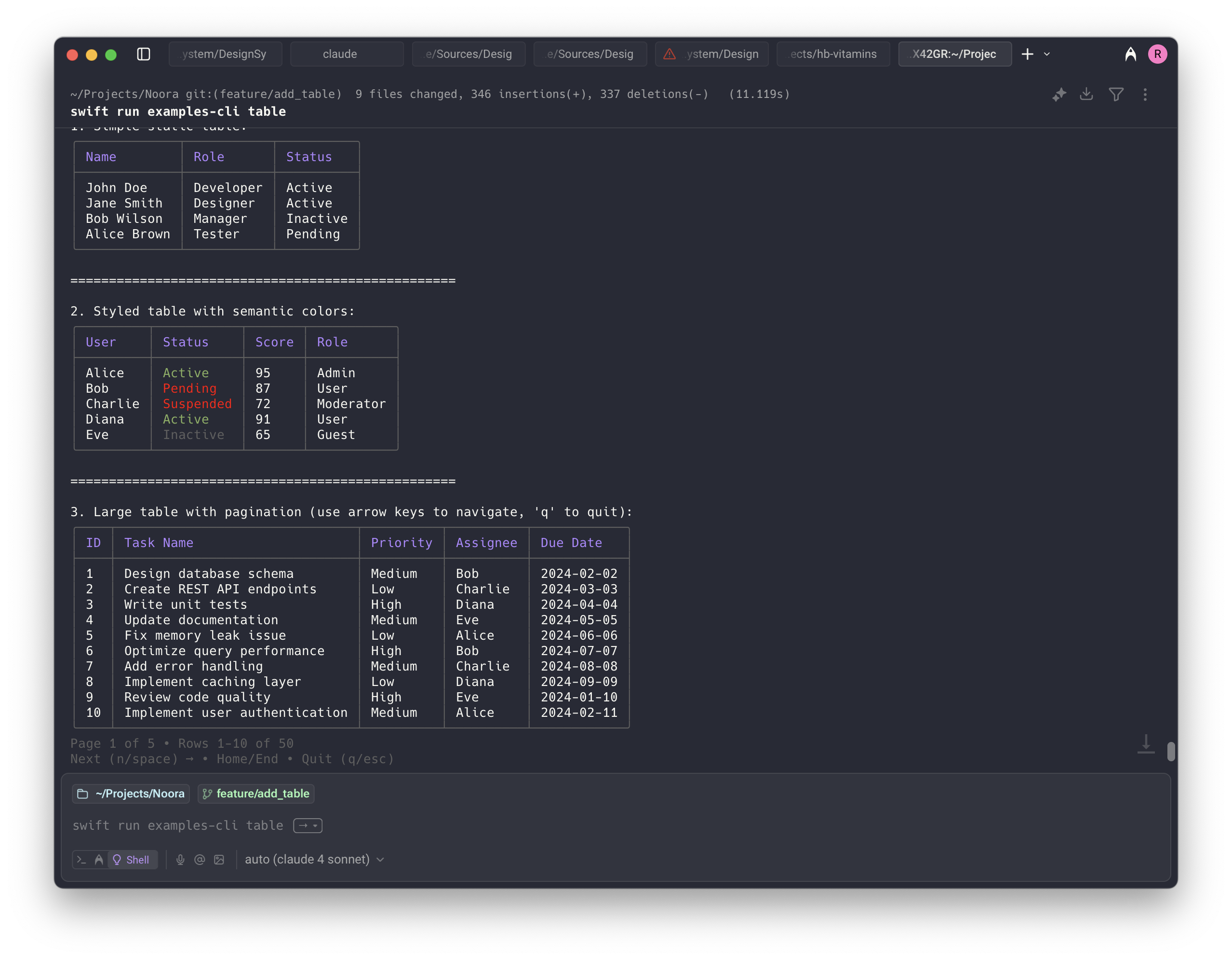
This component displays tabular data in a read-only format. Perfect for showing structured information like file listings, configuration data, or any structured content that doesn't require user interaction.
| Property | Value |
|---|---|
| Interactivity | Non-required |
Demo
API
Basic Example
swift
// Simple table with string arrays
let noora = Noora()
noora.table(
    headers: ["Name", "Version", "Status"],
    rows: [
        ["React", "18.2.0", "Active"],
        ["Vue", "3.3.4", "Active"],
        ["Angular", "16.1.0", "Deprecated"]
    ]
)
Advanced Example with TableData
swift
// Advanced table with custom styling and column configuration
let columns = [
    TableColumn(title: "Package", width: .flexible(min: 10, max: 20), alignment: .left),
    TableColumn(title: "Version", width: .fixed(10), alignment: .center),
    TableColumn(title: "Status", width: .auto, alignment: .right)
]

let rows: [[TerminalText]] = [
    [
        TerminalText("React"),
        TerminalText("\(.primary("18.2.0"))"),
        TerminalText("\(.success("Active"))")
    ],
    [
        TerminalText("Vue"),
        TerminalText("\(.primary("3.3.4"))"),
        TerminalText("\(.success("Active"))")
    ],
    [
        TerminalText("Angular"),
        TerminalText("\(.muted("16.1.0"))"),
        TerminalText("\(.warning("Deprecated"))")
    ]
]

let tableData = TableData(columns: columns, rows: rows)
noora.table(tableData)
Semantic Styling Example
swift
// Table with semantic styling for better visual hierarchy
let headers: [TableCellStyle] = [
    .primary("Package"),
    .secondary("Version"),
    .accent("Status")
]

let rows: [StyledTableRow] = [
    [.plain("React"), .success("18.2.0"), .success("Active")],
    [.plain("Vue"), .success("3.3.4"), .success("Active")],
    [.plain("Angular"), .muted("16.1.0"), .warning("Deprecated")]
]

noora.table(headers: headers, rows: rows)
Options
Basic table method
| Attribute | Description | Required | Default value |
|---|---|---|---|
headers | Array of column header strings | Yes | |
rows | Array of row data (each row is an array of strings) | Yes | |
renderer | A rendering interface that holds the UI state | No | Renderer() |
Advanced table method with TableData
| Attribute | Description | Required | Default value |
|---|---|---|---|
data | TableData object with custom columns and content | Yes | |
renderer | A rendering interface that holds the UI state | No | Renderer() |
Semantic styling method
| Attribute | Description | Required | Default value |
|---|---|---|---|
headers | Array of column headers with semantic styling | Yes | |
rows | Array of row data with semantic styling | Yes | |
renderer | A rendering interface that holds the UI state | No | Renderer() |
TableColumn Options
| Property | Description | Options |
|---|---|---|
title | Column header text | TerminalText or String |
width | Column width behavior | .auto, .fixed(Int), .flexible(min: Int, max: Int?) |
alignment | Text alignment | .left, .center, .right |
TableCellStyle Options
| Style | Description |
|---|---|
.plain(String) | Standard text without special styling |
.primary(String) | Primary theme color styling |
.secondary(String) | Secondary theme color styling |
.success(String) | Success/positive styling (typically green) |
.warning(String) | Warning styling (typically yellow/orange) |
.danger(String) | Error/danger styling (typically red) |
.muted(String) | Subdued/muted styling |
.accent(String) | Accent color styling |